"Netanyahu last week tweeted a PR-style infographic opposing the deal that the United States and other countries are negotiating to lift some sanctions on Iran. He called it an “important message” and urged his 188,000 or so followers to share it. The graphics were a tad cartoonish. We assumed that one illustration was meant to be a mushroom cloud, but it looked a lot like a tree. And another one was . . . a missile, right? Still, it seemed an improvement over the poster depicting a bomb that he paraded last year in front of the U.N. General Assembly. “Netanyahu’s bomb cartoon is the Middle East equivalent of Clint Eastwood’s chair,” columnist Jeffrey Goldberg tweeted at the time. We decided to check our amateur critique against a professional’s. So we asked Alberto Cairo , an expert on graphic design and a University of Miami journalism professor, to analyze Netanyahu’s resentations. The professor indicated that if they had been the works of one of his students, they would have received failing grades. First, he says, the initial problem is content: Such visuals are often used in the PR and marketing world, and they are a far cry from “real” infographics, which are journalistic products that he calls a “visual representation of evidence.” And then there are the aesthetics. Netanyahu’s are “just ugly and badly designed,” Cairo said.""
skip to main |
skip to sidebar

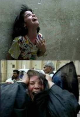
(Iraqis react to Bush's "liberation" of their country).

(At the American University of Beirut in 2010)

(Angry Arab speaks at Burj Barajnah Palestinian Refugee Camp, June '04).


-Jordanian Foreign Policy
-An analysis of Colin Powell's UN Speech
-The performance of the Arab media during the war
-Media and their ties to Governments in the Arab World
-Future of Arab Media
-Bush's Inauguration
-Popular Pressures and Prospects of Change
-The Lebanese Crisis
-The Mehlis Crisis
-French Role in Lebanon
-The Israeli Lobby Debate
The US Presidential Contest
Counting them, one by one...
-AIDS/HIV victims:
-Palestinians
-Innocent victims of the US war in Afghanistan
-Innocent victims of the US war in Iraq:
Help speed her canonization! Make miracles up!
-Sainthood cause of Mother Teresa moves to Vatican
-Mother Teresa's miracles to be revealed
-As'ad's sink was miraculously unclogged in October 2003
-Penelope Cruz to act in movie on Mother Teresa (the Unclogging of my Kitchen sink will be featured in the movie: one of her best known miracles to date)
-Economist has reported on October 30th, 2003 that a Catholic priest "placed a relic of Mother Teresa" on the body of Terri Schiavo who has been in a coma in a Florida hospital.
-This is an interview with somebody who met Mother Teresa. Note that he mentioned that Mother Teresa "pulled a piece of bread out of her apron pocket". What he did not mention is that she also kept 16" Pizza (with eggplants), two serving of Kung Pao Chicken, 3 Black Forest Cakes, 57 oranges, and 478 burritos all in her apron pocket. How did she fit all that? Well, you know how.(Thanks to Kyle for the link)

Comic by Terry Furry, reproduced from "Heard the One About the Funny Leftist?" by Cris Thompson, East Bay Express
A source on politics, war, the Middle East, Arabic poetry, and art.
PayPal Contribution for Asad AbuKhalil's Legal Defense Fund

(Iraqis react to Bush's "liberation" of their country).

(At the American University of Beirut in 2010)

(Angry Arab speaks at Burj Barajnah Palestinian Refugee Camp, June '04).


As'ad's Library
- -My blog posts for Al-Akhbar English
- -The Battle For Saudi Arabia: Royalty, Fundamentalism, and Global Power
- -Bin Laden, Islam, and America's New "War on Terrorism"
- -Historical Dictionary of Lebanon
- -America and the New "War on Terrorism": Who Split the World into Two? (Arabic)
- -Shattered Illusions: Analyzing the War on Terrorism (Chapter: Orientalism, Alive and Well)
- -Between the State and Islam (Chapter: Against the Taboos of Islam: Anti-Conformist Tendencies in Contemporary Arab Islamic Thought)
- -The Greenwood Encyclopedia of Women's Issues Worldwide: The Middle East and North Africa (Chapter on women in Saudi Arabia)
- -Women in the Middle East
- -It is War. (Arabic)
- -Terrorism or Resistance? Against the Criteria of Bin Laden or Arab Neo-Cons(Arabic)
- -Lebanon and Syria: searching for a map?
- -In Their Memory, and Not in His. (Arabic)
- -Features (and virtues) of French Secularism(Arabic)
- -The Status of Zionism, in Europe and US(Arabic)
- -Sex and the Suicide Bomber
- -On Democratic Party Elections
- -Any Objection to US Violation of Lebanese Sovereignty?
- -Repercussions of American fumbling in Iraq
- -The One Who Returned, By Crowning.
- -After Arafat
- -Who is He?
- -What Bashir Gemayyel Represents: the Legacy of Lebanese Fascism
- -Incoherence of the Opposition: Production of Sectarian Dynasties
- -The Folklore of Lebanese Patriotism: What the Fluttering Flags Could not Hide
- -Against Francophonie: The Falsity of Lebanese Culture
- -How do we Stay Arab, How do we Stay Human? Or, Challenging Globalization
- -U.S.-Saudi Arabia relations
- -The Islam Industry
- -Muhsin Ibrahim and the Repercussions of Self-Criticism: So as Not to Unfairly Criticize Thy Self
- -Critique of Arab Media Coverage of the War, TV
- -Walid Jumblat: For and Against
- -Pierre Laval: Statesman
- -My Eulogy of Joseph Samhah: He died just as He lived: Hands Unbound, Free
- Wasfi At-Tal: the Authentic Arab Nationalist
- When Ahmad Hajj Remembered Mistakes of Nasser
- In Defense of Conspiracy Theory
- Islamic Rule in Gaza? Oh, What Horror!
- Who Can Rescue the Shi`ites (Except Sa`d Hariri)?
- Did the Aggression on Lebanon have Aides?
- The Triumph of Phalangist Ideology
- Pakistan...First
- Two Phases in the History of Arab Liberalism
Media Appearances
Angry Arab Youtube
-LA Times' Profile of Angry Arab
-CNN
-Newshour
-Bill Maher's Politically Incorrect
-CNN International (Q & A Show)
-My experiences living under Israeli Occupation (Boston Globe)
-Syrian Role in Lebanon
-My debate with Manji
-A Long Interview with Al-Quds Al-`arabi
-A Statue to Reason: A Chat with Angry Arab
-Angry Arab doesn't pull any punches
AlJazeera Appearances' Transcripts
The Forgotten Victims
Chicken McNuggets in the News
Mother Teresa Miracle Watch

Comic by Terry Furry, reproduced from "Heard the One About the Funny Leftist?" by Cris Thompson, East Bay Express
As'ad's Bio
As'ad AbuKhalil, born March 16, 1960. From Tyre, Lebanon, grew up in Beirut. Received his BA and MA from American University of Beirut in pol sc. Came to US in 1983 and received his PhD in comparative government from Georgetown University. Taught at Tufts University, Georgetown University, George Washington University, Colorado College, and Randolph-Macon Woman's College. Served as a Scholar-in-Residence at Middle East Institute in Washington DC. He served as free-lance Middle East consultant for NBC News and ABC News, an experience that only served to increase his disdain for maintream US media. He is now professor of political science at California State University, Stanislaus. His favorite food is fried eggplants.
Email the Angry Arab at:
aabukhalil[at]csustan [dot][edu]
aabukhalil[at]csustan [dot][edu]
Most Circulated Posts
- Don't Cry for Me Mesopotamia: No Tears for Saddam
- -The Kingdom of Heaven (and of Plunder...)
- -The capital of ranking: Lebanon
- -American Left and the Middle East
- -Hariri's assasination
- -The Amir and Me
- -Angry Arab review of "Fahrenhiet 9/11"
- -The Angry Arab plan for the rescue of Iraq
- -The story of an Iraqi boy who looks like Bush
- -Hithcens vs. Galloway: The big debate
- -Sushar Rosky, lest she die namelessly...
- -The Angry Arab guide to Middle East Media
- -Bomb Them or Talk to Them?
- -What did Mehlis Know, and How did He know it?
- -Angry Candidate? No way
- -Arab Officials Don't Commit Suicide
- -Spielberg on Munich
- -Anniversary of the Lebanese Civil Wars
- -The Demise of Fath: And What is Hamas?
Blog Archive
- Dec 2018 (1)
- Nov 2018 (8)
- Oct 2018 (20)
- Sep 2018 (19)
- Aug 2018 (18)
- Jul 2018 (21)
- Jun 2018 (30)
- May 2018 (43)
- Apr 2018 (50)
- Mar 2018 (91)
- Feb 2018 (87)
- Jan 2018 (75)
- Dec 2017 (90)
- Nov 2017 (135)
- Oct 2017 (170)
- Sep 2017 (147)
- Aug 2017 (222)
- Jul 2017 (180)
- Jun 2017 (215)
- May 2017 (295)
- Apr 2017 (257)
- Mar 2017 (213)
- Feb 2017 (366)
- Jan 2017 (353)
- Dec 2016 (502)
- Nov 2016 (423)
- Oct 2016 (384)
- Sep 2016 (279)
- Aug 2016 (247)
- Jul 2016 (272)
- Jun 2016 (201)
- May 2016 (272)
- Apr 2016 (319)
- Mar 2016 (337)
- Feb 2016 (368)
- Jan 2016 (346)
- Dec 2015 (389)
- Nov 2015 (391)
- Oct 2015 (421)
- Sep 2015 (326)
- Aug 2015 (306)
- Jul 2015 (174)
- Jun 2015 (223)
- May 2015 (465)
- Apr 2015 (398)
- Mar 2015 (366)
- Feb 2015 (336)
- Jan 2015 (596)
- Dec 2014 (354)
- Nov 2014 (374)
- Oct 2014 (333)
- Sep 2014 (421)
- Aug 2014 (662)
- Jul 2014 (894)
- Jun 2014 (482)
- May 2014 (422)
- Apr 2014 (559)
- Mar 2014 (642)
- Feb 2014 (508)
- Jan 2014 (533)
- Dec 2013 (446)
- Nov 2013 (513)
- Oct 2013 (502)
- Sep 2013 (689)
- Aug 2013 (591)
- Jul 2013 (524)
- Jun 2013 (616)
- May 2013 (563)
- Apr 2013 (479)
- Mar 2013 (491)
- Feb 2013 (562)
- Jan 2013 (607)
- Dec 2012 (659)
- Nov 2012 (791)
- Oct 2012 (662)
- Sep 2012 (587)
- Aug 2012 (707)
- Jul 2012 (782)
- Jun 2012 (647)
- May 2012 (590)
- Apr 2012 (557)
- Mar 2012 (620)
- Feb 2012 (652)
- Jan 2012 (430)
- Dec 2011 (572)
- Nov 2011 (610)
- Oct 2011 (589)
- Sep 2011 (564)
- Aug 2011 (581)
- Jul 2011 (707)
- Jun 2011 (636)
- May 2011 (621)
- Apr 2011 (683)
- Mar 2011 (740)
- Feb 2011 (1167)
- Jan 2011 (932)
- Dec 2010 (454)
- Nov 2010 (423)
- Oct 2010 (203)
- Sep 2010 (313)
- Aug 2010 (309)
- Jul 2010 (280)
- Jun 2010 (202)
- May 2010 (284)
- Apr 2010 (403)
- Mar 2010 (497)
- Feb 2010 (502)
- Jan 2010 (385)
- Dec 2009 (581)
- Nov 2009 (584)
- Oct 2009 (575)
- Sep 2009 (525)
- Aug 2009 (529)
- Jul 2009 (498)
- Jun 2009 (478)
- May 2009 (444)
- Apr 2009 (484)
- Mar 2009 (475)
- Feb 2009 (488)
- Jan 2009 (925)
- Dec 2008 (733)
- Nov 2008 (530)
- Oct 2008 (578)
- Sep 2008 (504)
- Aug 2008 (602)
- Jul 2008 (476)
- Jun 2008 (516)
- May 2008 (535)
- Apr 2008 (473)
- Mar 2008 (548)
- Feb 2008 (502)
- Jan 2008 (459)
- Dec 2007 (411)
- Nov 2007 (415)
- Oct 2007 (405)
- Sep 2007 (425)
- Aug 2007 (652)
- Jul 2007 (653)
- Jun 2007 (789)
- May 2007 (892)
- Apr 2007 (537)
- Mar 2007 (681)
- Feb 2007 (596)
- Jan 2007 (697)
- Dec 2006 (729)
- Nov 2006 (424)
- Oct 2006 (608)
- Sep 2006 (490)
- Aug 2006 (959)
- Jul 2006 (921)
- Jun 2006 (311)
- May 2006 (547)
- Apr 2006 (568)
- Mar 2006 (500)
- Feb 2006 (469)
- Jan 2006 (504)
- Dec 2005 (582)
- Nov 2005 (424)
- Oct 2005 (462)
- Sep 2005 (556)
- Aug 2005 (518)
- Jul 2005 (273)
- Jun 2005 (201)
- May 2005 (465)
- Apr 2005 (360)
- Mar 2005 (306)
- Feb 2005 (289)
- Jan 2005 (520)
- Dec 2004 (397)
- Nov 2004 (461)
- Oct 2004 (411)
- Sep 2004 (515)
- Aug 2004 (503)
- Jul 2004 (363)
- Jun 2004 (180)
- May 2004 (481)
- Apr 2004 (393)
- Mar 2004 (421)
- Feb 2004 (341)
- Jan 2004 (490)
- Dec 2003 (489)
- Nov 2003 (324)
- Oct 2003 (230)
- Sep 2003 (171)
- The comments that appear in the comments' section are unedited and uncensored. The thoughtful and thoughtless, sane and insane, loving and hateful, wise and unwise ideas that they contain do not represent the Angry Arab. They only represent those who write them, whoever they are.
- Blog development, design, and conception by N.B. Christiansen, aka "the Affable Anglo"
